Anracine
Toward digital sensoriality.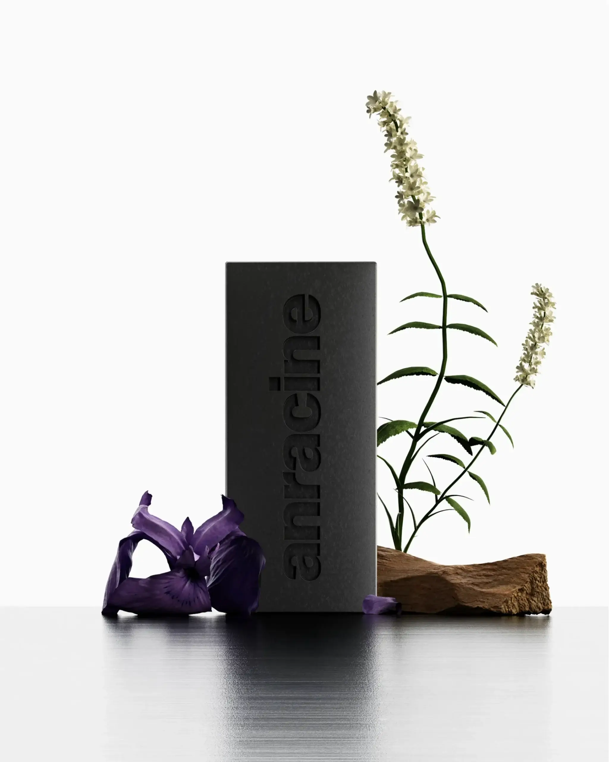
Friction
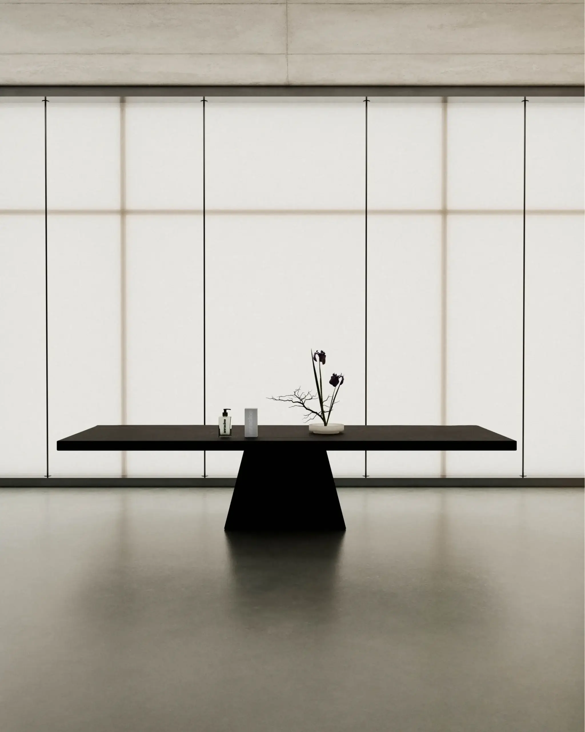
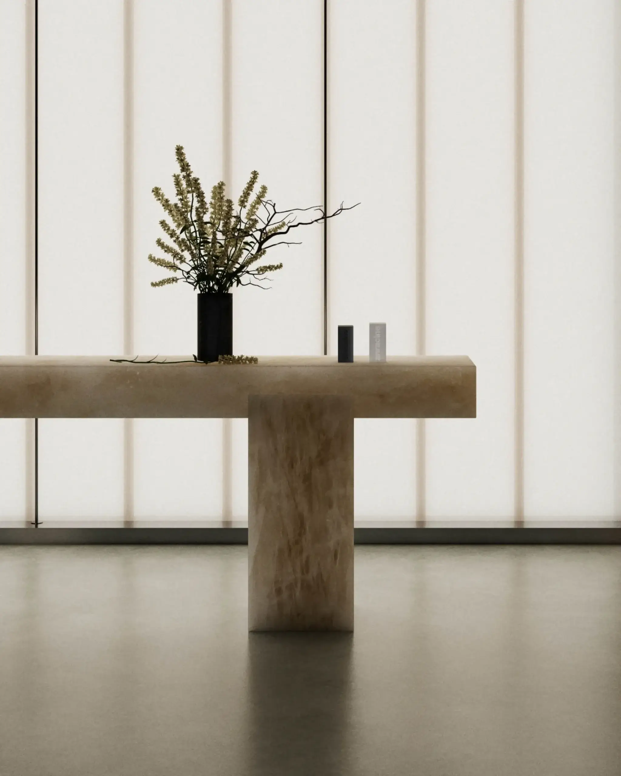
Defined by its refusal to compromise, Anracine had established a distinct position in contemporary skincare through its iconoclastic identity. Its visual universe of massive volumes, raw materials, and deliberately stripped-back design positioned it at the intersection of brutalist luxury and radical commitment. The brand sought to enrich its offering by developing a narrative dimension that would reveal the full sensory potential of its products in digital environments.
Solution
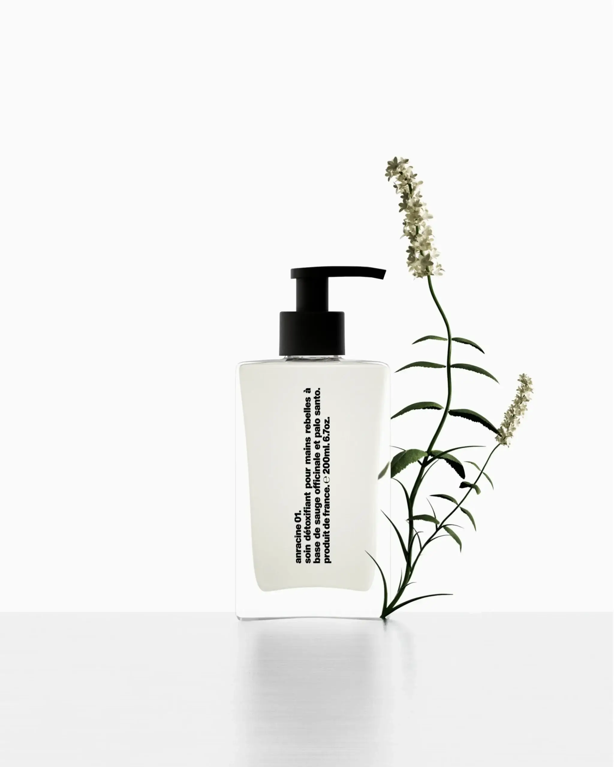
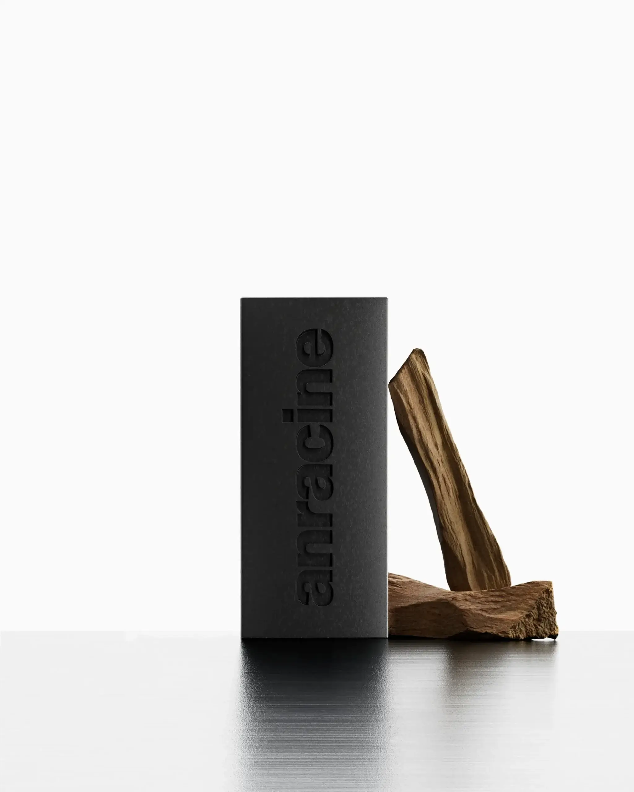
An image series was developed that elevated the sensory qualities of noble natural ingredients. Palo santo, sage, and iris butter became central elements in a visual narrative where elemental substance met refined restraint. Architectural compositions, textural contrasts, and minimalist arrangements created a deliberate dialogue between formal severity and sensory abundance, focusing entirely on the intrinsic qualities of each product.
Impact
This expansion added a tactile dimension to Anracine’s brand language, positioning transparency as the central organizing principle of its ecosystem rather than an isolated value point. In an era increasingly deprived of sensory exaltation, this approach reintroduced authentic sensory desire through the very screens that often distance us from physical experience, demonstrating how uncompromising aesthetics and sensory richness can coexist.